
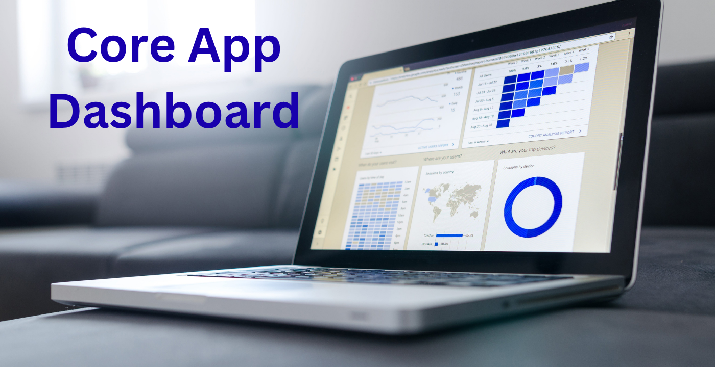
Today, in the era of the data-driven world, applications are no longer functionality-only but rather insights. Core App Dashboard is the control center of any new age application and provides users with an immediate and real-time view of performance, data and activity. As a developer, business owner, or product manager, the process of dashboards can be very helpful to decision-making and efficiency.
What is a Core App Dashboard?
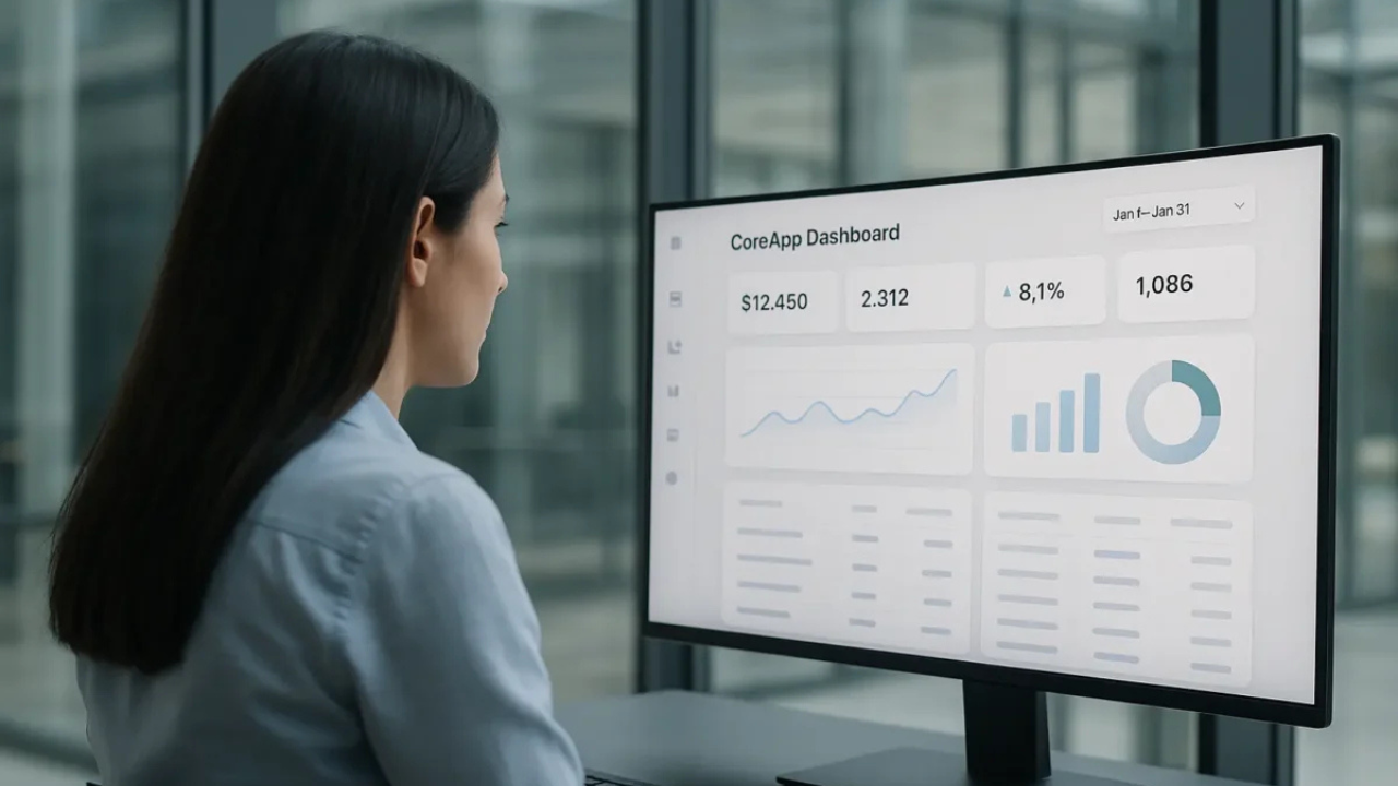
A Core App Dashboard is a visual interface that is central and visualizes key metrics and user activity and application performance. It is like a control panel where the user can monitor and control different features of an application without any issues.
It is well-integrated with the ecosystem of the application, with real-time information, analytics, and actionable insights unlike the traditional dashboards. It is a critical tool that facilitates the enhancement of workflow and performance tracking.
Why a Core App Dashboard Matters
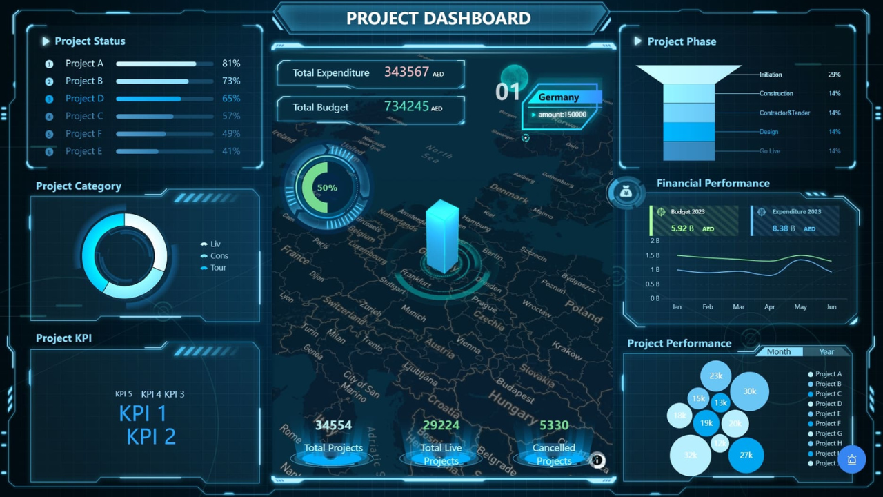
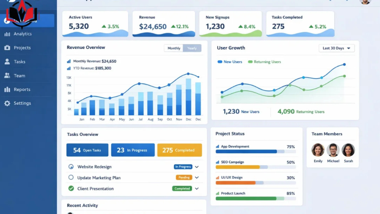
A dashboard is important because it enables the visualization of the complex data into simple diagrams. It allows faster and smarter decision-making by merging various sources of data into one interface.
Dashboards help businesses to track user behavior, monitor KPIs, and locate trends in real-time. This increases productivity besides making teams to be responsive to issues or opportunities.
Key Features of a Core App Dashboard
An effective dashboard must have a number of important elements that make it more user-friendly and effective:
1. Data Visualization
Dashboards are graphic and display information in charts, graphs, and even in the form of a widget, thus making complicated data easy to understand.
2. Real-Time Monitoring
Real-time updates of data are one of the strongest functions that enable the user to monitor the performance and activities in real-time.
3. User-Friendly Interface
A friendly design will make sure that the user can navigate the site with ease and locate significant information without getting lost.
4. Customization Options
The dashboards can be customized according to the needs of the users who can personalize the dashboards with the help of the use of widgets, layouts, and filters.
5. Integration Capabilities
The current dashboards are interconnected with APIs, databases, and third-party applications to deliver an entire ecosystem of data.
Designing an Effective Core App Dashboard
Design is a significant element of the achievement of every dashboard. The interface should be designed in such a way that it is simple to use, and a clean and structured layout should enhance the usability of the interface.
Wireframing and Prototyping
The initial one is the establishment of a prototype of the dashboard design. Such tools as Figma or Adobe XD are used to visualize structure and user flow and build it out before development.
UI/UX Principles
An effective dashboard adheres to major design principles of simplicity, consistency and clarity. Maintaining the interface simple and considering only the necessary information is a better way to make it easier to use.
Responsive Design
Dashboards ought to be compatible with all types of devices such as desktops, tablets, and smartphones.
Read Also: Techcarz com: A Platform for Technology News, Gadgets and Future Innovations
Technologies in the Development of Core App Dashboard
To create an effective dashboard, one needs to have the correct mix of frontend and backend technologies.
React, Angular, and Vue.js are typically frontend frameworks that are used to build interactive user interfaces.
The backend is provided with APIs and databases to guarantee the smooth flow of data and real-time updates. The integration tools bind various data sources enabling dashboards to provide reliable and valid information.
Steps to Build a Core App Dashboard
Designing a dashboard is a procedural process:
- Establish your objectives and user needs.
- Select the appropriate tools and technologies.
- Design the user interface and design.
- Combine data resources and APIs.
- Add functionality and debug functionality.
A process that has been well designed will make the dashboard user friendly and business wise.
Benefits of Using a Core App Dashboard
There are a number of benefits associated with the implementation of a dashboard:
- Real-time insights allow making decisions faster.
- Centralized data leads to improved productivity.
- Higher visualization of non-simple information.
- Improved user experience and easy to use design.
Dashboards enable consolidation of all the important data in a single place, enhancing efficiency and decreasing manual work.
Common Challenges and Solutions
In spite of the advantages, dashboards may encounter the following obstacles:
Data Overload: Filters and Focus on Important Measures.
Bad Design: Do not be a bad designer.
Integration Problems: APIs and tools used should be reliable.
Performance Issues: Backend and data query optimization.
The resolution of these problems will provide a quality and comfortable dashboard experience.
Final Word
A Core App Dashboard is not just a visual tool, but it is the framework of contemporary apps. It helps businesses to make smarter decisions by giving them real-time insights, simplifying complex data, and improving the user experience. Regardless of creating a new application or enhancing an already existing one, a properly designed dashboard can greatly increase its performance and efficiency.
FAQs
What is a Core App Dashboard?
A Core App Dashboard is a central application used to show important metrics, data and performance in real-time.
What is the value of a Core App Dashboard?
It assists users to keep track of performance, data analysis, and faster and more data-driven decisions.
What do you think a Core App Dashboard ought to look like?
The key features are data visualization, real-time updates, customization and integration capabilities.
What technologies are utilized to construct dashboards?
Some of the common technologies are React, Angular, APIs, and database integration tools.
What will I do to make my dashboard user friendly?
Dwelling upon the clean design, simple navigation, and responsive layouts will help to make it easier to use.
Read More: Webinbound com: A Complete Guide to Guest Posting and SEO Growth